Annoucement | Tai Hing Launches New Logo
The self-owned brand logo of Tai Hing was established in 1991, with filaments, circle and red tone as the main design elements. After years of development, Tai hing now has a variety of monofilament products and provides services to many countries and regions.
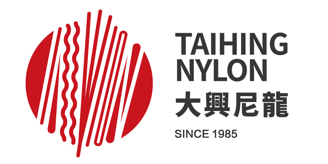
Tai Hing Nylon Filament Products Co., Ltd. is pleased to announce the launch of a new logo that is part of a strategy to greatly enhance the recognition of the products and build the international brand image of Tai Hing in the monofilament industry.
-02-e1583898578228.png)
The new logo utilizes different monofilament patterns, circles and red elements to symbolize our multiple products and subtly forms the word "NYLON.”
The trident filaments in the middle represent three generations and our efforts and experience over 30 years and alludes to Tai Hing’s dedicated commitment to customers.
The circle represents a core Chinese value that symbolizes the pursuit of perfection and balance and refers to Tai Hing’s goal to serve companies across the world.
Tai Hing will continue to diversify operations and seek breakthroughs in monofilament and its applications with the mission of becoming the best filament manufacturer in the world.
The implementation of the new logo on the company website, product advertising, technical information, employee business cards and relative items will be rolled out gradually.
Learn more about Tai Hing at www.taihingnylon.com.
//The new logo will be officially effective from the date of the notification of the change.
The implementation of the new logo on the company website, product advertising, technical information, employee business cards and relative items will be rolled out gradually.
Both new and old logo have the same legal effect during the switch. We apologize for any inconvenience this may cause. Thank you. //
Best regards,
Tai Hing Nylon Filament Products Co., Ltd.


